UN Backs New Map That Finally Shows Africa’s True Size
World News | Geography
UN Backs New Map That Finally Shows Africa’s True Size
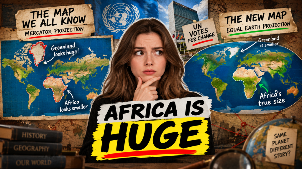
For generations, millions of people have grown up looking at the same familiar world map. It has appeared in classrooms, textbooks, offices and websites, shaping the way people imagine the planet. But there is a major problem with that familiar picture: it does not accurately show the relative size of the world’s continents.
Now, the United Nations has backed a resolution supporting greater use of a world map that gives a more realistic picture of the size of Africa and other regions. The move has reignited a long-running debate over the famous Mercator projection and the way maps influence our understanding of the world.
At the centre of the discussion is the Equal Earth projection, a map created to preserve the relative surface areas of continents much more accurately than Mercator.
What Did the UN Vote For?
The United Nations General Assembly has adopted a resolution encouraging the use of the Equal Earth projection as an alternative to traditional world maps when the goal is to represent the actual relative size of land areas.
The resolution received overwhelming support, with 164 countries voting in favour. The United States voted against the measure, while six countries abstained.
The initiative was backed by Togo and supported by members of the African Union. It forms part of a broader campaign known as #CorrectTheMap, which argues that commonly used world maps give people a distorted impression of Africa’s geographical scale.
However, the vote does not mean the Mercator projection has been banned. The UN resolution is not legally binding. Instead, it encourages countries, schools, organisations and other institutions to consider maps that provide a more accurate representation of continental areas.
That distinction is important because the Mercator projection still has practical uses. It was designed with navigation in mind and remains useful in situations where preserving directions and angles is more important than showing accurate land areas.
Why Does Africa Look Smaller on the World Map?
The reason is surprisingly simple: the Earth is round, but most maps are flat.
When cartographers try to transform a three-dimensional globe into a two-dimensional map, some form of distortion is unavoidable. Different map projections make different compromises. Some preserve direction, some preserve area, while others attempt to balance shape, distance and visual appearance.
The Mercator projection was developed by Flemish cartographer Gerardus Mercator in 1569. It became especially important for navigation because straight lines on the map could represent constant compass bearings.
The trade-off is that areas become increasingly enlarged as they move away from the Equator. Countries and continents in northern and southern high latitudes can therefore look far larger than they really are.
Africa, on the other hand, is located largely around the Equator and therefore does not receive the same visual enlargement.
The result can be striking. On a traditional Mercator world map, Greenland can appear visually comparable to Africa. In reality, Africa is roughly 14 times larger than Greenland.
The problem is not that the Mercator map is simply “wrong”. Its distortion is a consequence of the projection it uses and the purpose for which it was originally designed.
What Is the Equal Earth Map?
The Equal Earth projection was introduced in 2018 as a modern alternative for showing the world while maintaining accurate relative surface areas.
Unlike Mercator, an equal-area projection aims to ensure that the size of regions on the map corresponds to their actual relative size on Earth.
This makes a major difference when looking at Africa.
On an Equal Earth map, Africa takes up a much more realistic share of the world’s landmass. Greenland becomes dramatically smaller in comparison, while other regions affected by the Mercator projection also move closer to their true proportions.
The projection is not designed to make every country look perfectly shaped. No flat map can preserve everything at once. Instead, its strength is that it gives viewers a better visual understanding of the relative area occupied by different parts of the planet.
For education and general world maps, that can be particularly useful.
Readers interested in understanding how different projections work can explore our World Geography Guide and How World Maps Work.
Africa Has Not Suddenly Become Bigger
One of the most important things to understand about this debate is that Africa itself is not changing size.
The continent has always occupied roughly the same area on Earth. What changes is the way that area is displayed on a flat surface.
The UN-backed initiative is therefore not about physically making Africa larger. It is about correcting the visual impression created by a particular type of map projection.
For decades, people have become accustomed to seeing Europe, North America and other northern regions displayed at enlarged scales. At the same time, Africa and areas closer to the Equator can appear comparatively smaller.
The Correct the Map campaign argues that this visual distortion matters because maps are often people’s first introduction to geography.
If the same distorted representation is repeatedly used in schools, media and public information, it can influence how people intuitively understand the relative size and importance of different regions.
Why the Map Debate Matters to Africa
The issue has become especially significant for African countries because the continent is enormous.
Africa covers about 30 million square kilometres, making it the second-largest continent by land area. Yet its appearance on many familiar maps can give people a dramatically different impression.
Africa is large enough to contain several of the world’s biggest countries within its overall landmass. The United States, China, India and other major countries could fit into Africa while still leaving substantial space.
Seeing that scale on a map can change the way people think about Africa’s geography.
Its size is closely connected to its extraordinary diversity. The continent contains deserts, tropical forests, savannahs, mountains, large river systems and extensive coastlines. It also spans multiple climate zones and contains an enormous range of ecosystems.
A more accurate map cannot explain all of that complexity, but it can provide a better starting point.
For more coverage, visit our Africa News and Geography section.
Is the Mercator Projection Actually Wrong?
This is where the debate needs some context.
Calling the Mercator projection simply “wrong” is misleading. It was created for a specific purpose and solved an important problem for sailors and navigators.
Its major advantage is that it preserves local angles and directions. For navigation, that property can be extremely valuable.
The issue arises when the projection is used for something it was not designed to do: accurately compare the physical sizes of continents and countries.
If someone wants to understand which continent is larger, an equal-area projection is much more appropriate.
In other words, the question is not necessarily whether Mercator should disappear. It is whether people should have access to maps that are appropriate for the information they are trying to understand.
Why Maps Have More Influence Than We Realise
Maps may look like neutral pieces of information, but every map is a design decision.
Cartographers have to decide what should be preserved and what can be distorted. A map that prioritises navigation will look different from one designed to compare population density, land area or climate.
That means there is no single perfect world map.
The UN debate has brought attention to something many people never stop to consider: the image of the world in their heads has partly been shaped by the maps they have seen.
When a map enlarges some regions and reduces others, it can subtly influence people’s sense of distance and scale.
This is particularly important in education. Children learning geography from a distorted general-purpose map may not immediately understand that the visual proportions they see are not the same as the actual proportions of the planet.
What Could Change After the UN Resolution?
The UN vote is unlikely to transform every world map overnight. Because the resolution is not legally binding, countries and organisations are free to continue using the projections they consider appropriate.
However, it could encourage gradual changes in education, publishing and public communication.
- Schools could use more equal-area maps in geography lessons.
- Publishers could include accurate continental comparisons in textbooks.
- News organisations could use different projections depending on the subject.
- Governments could adopt equal-area maps for general informational purposes.
- Technology companies could make alternative world-map projections easier to access.
Digital platforms may ultimately have the biggest influence.
People today encounter maps through smartphones, websites, online news, weather applications and social media. The map shown on a screen can reach millions of people far more quickly than a printed atlas.
If major digital platforms begin offering more equal-area representations for general world views, the change could become increasingly familiar to the public.
The US Vote Against the Resolution
The overwhelming support for the resolution did not mean every country agreed with the initiative.
The United States voted against it. The opposition reflects a broader disagreement about whether the issue deserves the level of international attention it has received.
Supporters of the resolution see the map issue as a question of accurate representation and education. Critics have argued that the United Nations should focus its attention on more pressing global challenges.
That disagreement highlights why the debate has become about more than cartography.
For supporters, the map is symbolic as well as geographical. They argue that changing the way Africa is visually represented can challenge outdated perceptions and give people a clearer understanding of the continent’s actual scale.
Will Google Maps and Other Online Maps Change?
There is no requirement for Google Maps or other mapping services to immediately replace their existing systems.
Different digital maps are built for different purposes. Navigation services, for example, may prioritise properties that help users calculate routes and directions rather than accurately compare continental land areas.
The more likely change is that organisations will increasingly use different projections for different purposes.
An educational website explaining continental size might use an equal-area projection, while a navigation application could continue using a projection suited to route planning.
That approach recognises an important fact about cartography: the best map depends on what you are trying to show.
What the New Map Could Teach Us About Africa
Perhaps the most interesting outcome of the UN vote is not whether one projection eventually replaces another. It is that the discussion encourages people to question familiar information.
Africa’s geographical scale is just one example.
Once people compare different projections, they can see how dramatically a flat map can influence perception. Countries that appear enormous may be much smaller in reality, while regions that look relatively compact can cover huge areas.
For students, travellers, researchers and anyone interested in global affairs, understanding that difference is useful.
It encourages a more informed approach to maps instead of treating every world map as an exact picture of the planet.
Frequently Asked Questions
What new world map did the UN support?
The UN General Assembly supported a resolution encouraging greater use of the 2018 Equal Earth projection, which provides a more accurate representation of the relative surface areas of continents.
How many countries supported the UN resolution?
A total of 164 countries voted in favour of the resolution. The United States voted against it and six countries abstained.
Is Africa actually getting bigger?
No. Africa’s physical size has not changed. The difference comes from how its land area is represented on different types of maps.
Why does Greenland look so big on a Mercator map?
The Mercator projection increasingly enlarges areas as they move away from the Equator. Greenland is located at a high latitude, so it appears much larger than its actual area.
How much bigger is Africa than Greenland?
Africa is approximately 14 times larger than Greenland by surface area, even though the two can look surprisingly similar in size on a traditional Mercator map.
Will the Mercator map be banned?
No. The UN resolution is not legally binding. Mercator also remains useful for navigation and other specialised applications.
What is the Equal Earth projection?
Equal Earth is an equal-area world map projection introduced in 2018. It is designed to show continents in proportion to their actual surface areas while maintaining a visually balanced world map.
Final Thoughts
The UN vote over the world’s map may sound like a technical issue, but it has opened a much larger conversation about how humans see the planet.
The Mercator projection has played an important role in navigation for centuries and remains useful for specific purposes. But when it is used as a general picture of the world, its distortion can create a misleading impression of the relative size of continents.
The Equal Earth projection offers another option. It does not make Africa larger. Instead, it allows people to see the continent closer to its actual geographical scale.
Whether the Equal Earth map becomes a standard in classrooms and digital platforms remains to be seen. But the UN vote has already achieved something significant: it has encouraged people around the world to look at a map they thought they knew and ask a simple question — does this really show the world as it is?
Leave a Reply